Types of charts
Written By Natalia
Last updated Over 1 year ago
Read before starting:
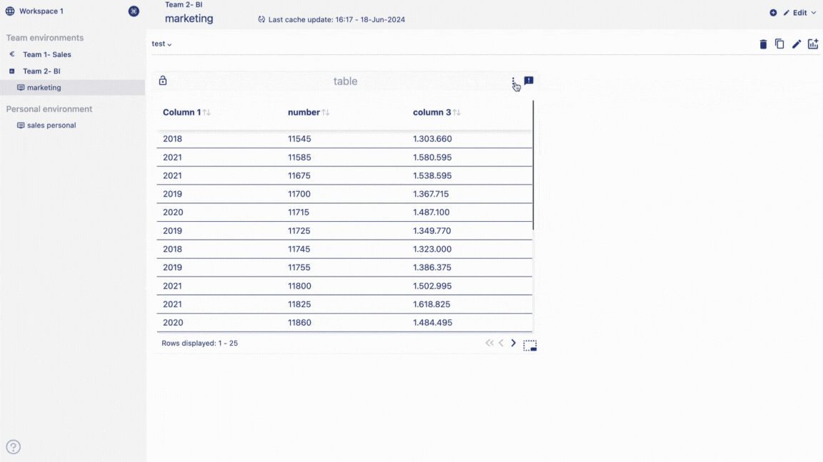
Data table
In this chapter, we are going to walk you through how you can create a data table using the Anlytic platform.
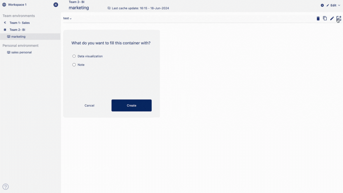
Create a data table
Add a visualization container to your dashboard. Select the option 'Data visualization' and click on 'Create'.This will take you to the create visualization page.
Add a title to your data table and add description of the data table. Choose visualisation type as 'Data table'. Choose data from catalog by double clicking on the column names.
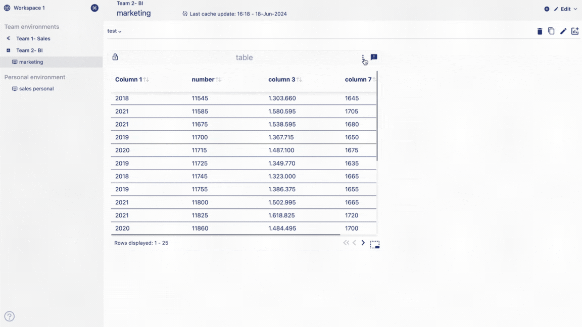
Drag and drop data chips from the selection container to column and data container. Your data table will be displayed on the visualization container. You can add multiple columns into the column container. Click on create visualization button to create and save the table in your dashboard. The Data table is added in the dashboard.
Edit a data table
Hover of the title of the table container. Click on 'Edit' from the option menu.
Make changes to your table according to your need and click on 'change table' button to save your changes.
Delete a data table
Hover of the title of the table container.
Click on 'Delete' from the option menu.
Click on 'Delete' to confirm your choice.
Your table will be permanently deleted.
Point chart
In the Anlytic platform, charts are divided into multiple groups. Dividing the charts into multiple groups allows the user to convert a chart to a different chart from under the same group. This is true for the point chart group. For example, if you create a line chart, you can convert it into another point chart such as an area chart, scatter plot, bar chart or stacked bar chart, just with one click, because they all fall under the same group.
Point chart group consists of charts such as line chart, area chart, scatter plot, bar chart and stacked bar chart. Below we have explained how you can create point charts.
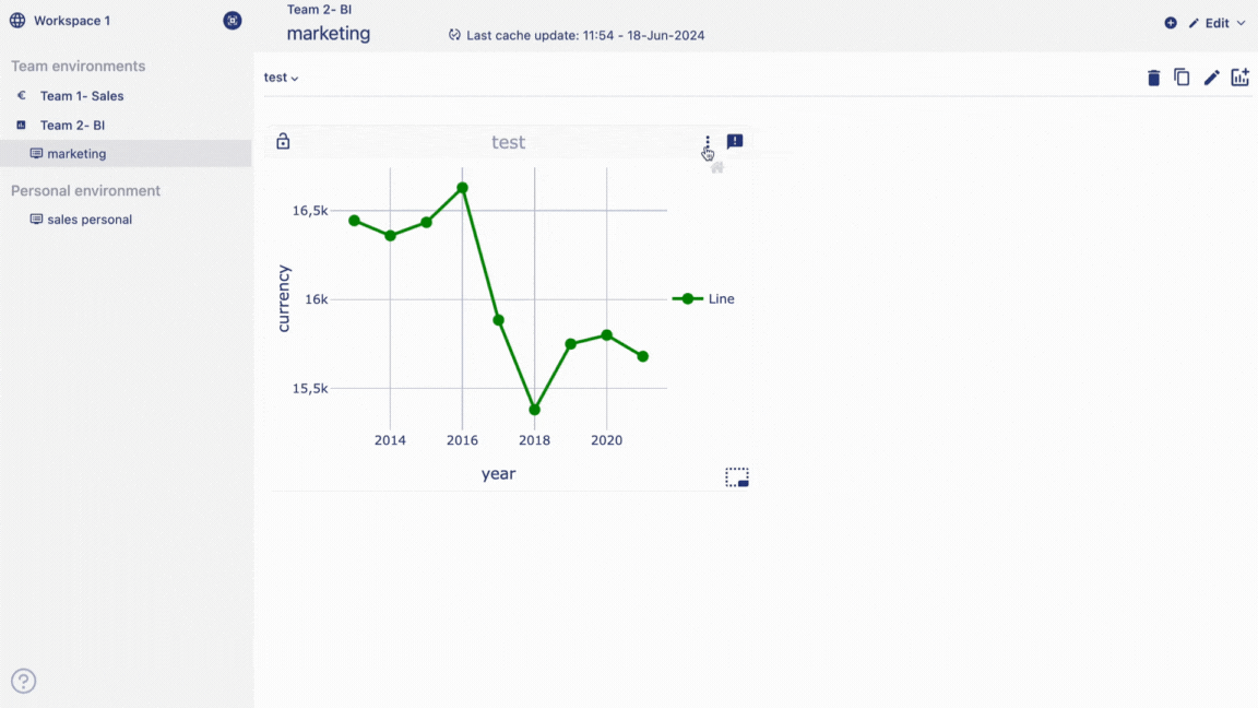
Line chart
Line charts are useful for showing trends over time and comparing data series. Whether tracking sales performance, monitoring website traffic, or analyzing financial data, line charts offer a clear and intuitive representation of temporal changes. With our platform, users can effortlessly create and customize line charts to suit their specific needs. Apply filters such as line filter or chart filters or functions to create the perfect point chart you need.
Create a line chart
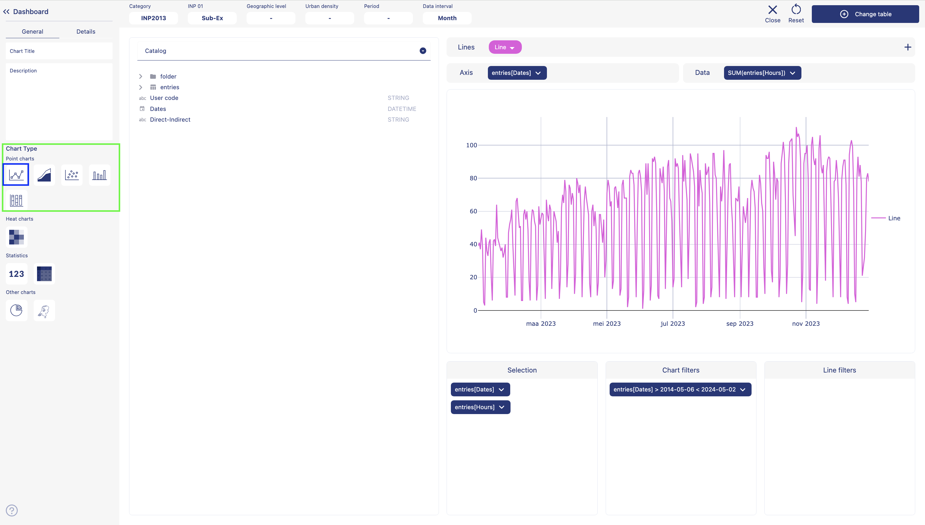
Choose a dashboard from the sidebar. Go to edit mode. Add a row. Add a visualization container to your dashboard. Select the option 'Data visualization' and click on create. This will take you to the create visualization page.
Give a title to your graph. Add descriptions about the chart. Select chart type as line chart by clicking on the line chart icon. Click on table name from the catalog. Double click on the column names from the catalog. Columns will be added as data chip into the selection container.
Add a line by clicking on the '+' icon in lines container. Give a name to your line and choose a color. Grab a data chip from the selection container. Drag and drop the chip into 'axis container'. Grab another data chip from the selection container. Drag and drop the chip into 'data container'. You should see the chart displayed on the chart container.
Grab the data chip either from axis placeholder or data place holder, drag and drop the chip into chart filters container to apply a filter. Grab the data chip either from axis placeholder or data place holder, drag and drop the chip into line filters container to apply a filter.
Click on 'Details' from the sidebar. Add lebels to the X and Y axes. Adjust line thickness and point size. Click on 'Create visualization' from the top right corner of the page. Your visualizations is saved and displayed on the dashboard.
Follow the similar steps to create an area chart, scatter plot, bar chart and stacked bar chart.
Convert a line chart into other point charts
As mentioned earlier, charts are divided into multiple groups. Dividing the charts under multiple groups allows the user to convert a chart to a different chart from under the same group. It is true for the point chart group. For example, if you create a line chart, you can convert it into another chart such as area chart, scatter plot, bar char or stacked bar chart, just with one click, because they all fall under the same group.
Follow the steps below to convert point charts:
Hover over a point chart container from the dashboard. Three dot will appear on the top right hand corner of the visualization container. Click on the three dots and an option menu will appear. Click on 'edit' from the option menu.
From the side bar, under chart types, from the point charts group, click on either area chart, scatter plot, bar chart, stacked bar chart. In the chart visualization container you can see the chart converting depending on what you choose. Click on change table from the top right corner of the page.
Your visualizations is saved and displayed on the dashboard.
Edit a point chart
Follow the steps below to edit point charts:
Hover over a point chart container from the dashboard. Three dot will appear on the top right hand corner of the chart container. Click on the three dots and an option menu will appear. Click on 'edit' from the option menu.
After making the chages to the chart, click on change table from the top right corner of the page. Your chart changes is saved and chart is displayed on the dashboard.
Delete a point chart
Follow the steps below to delete point charts:
Hover over a point chart container from the dashboard. Three dot will appear on the top right hand corner of the chart container.
Click on the three dots and an option menu will appear. Click on 'Delete' from the option menu. Click on 'Delete' to confirm your choice. Your chart is permanently deleted.
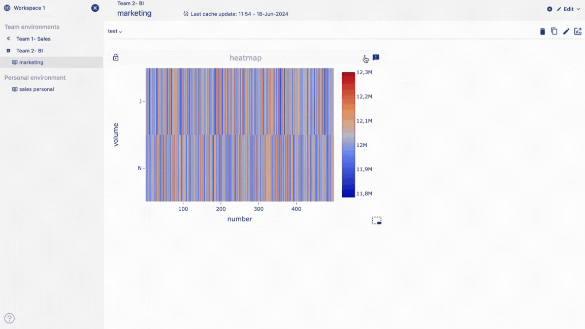
Heatmap
Heatmap is a powerful tools for representing complex data sets in a visually intuitive manner. Heatmaps offer a graphical representation of data where values are depicted using colors, with each color representing a different level of intensity or magnitude.
Create a heatmap
Add a visualization container to your dashboard. Select the option data visualization and click on create. This will take you to the create visualization page.
On the sidebar, Give a title and add descriptions about the chart.
Select chart type as heatmap by clicking on the heatmap icon.
Click on table name from the catalog.
Double click on the column names from the catalog.
Columns will be added as data chip into the selection container.
Grab a data chip from the selection container.
Drag and drop the chip into 'x-axis container'.
Grab a data chip from the selection container.
Drag and drop the chip into 'y-axis container'.
Grab another data chip from the selection container.
Drag and drop the chip into 'data container'.
You should see the chart displayed on the chart container.
Click on details from the sidebar.
Add level to the X and Y axis.
Click on create visualization from the top right corner of the page.
Heatmap is displayed on the dashboard.
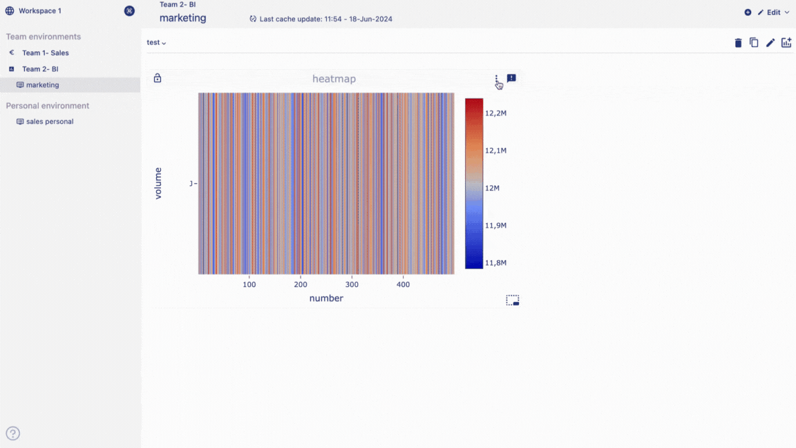
Edit a heatmap
Follow the steps below to edit heatmap:
Hover over a heatmap container from the dashboard. Three dot will appear on the top right hand corner of the chart container. Click on the three dots and an option menu will appear. Click on 'edit' from the option menu.
After making the chages to the chart, click on change table from the top right corner of the page. Your chart changes are saved and chart is displayed on the dashboard.
Delete a heatmap
Follow the steps below to delete heatmap:
Hover over a heatmap container from the dashboard.
Three dot will appear on the top right hand corner of the chart container.
Click on the three dots and an option menu will appear.
Click on 'delete' from the option menu.
Click on delete to confirm your choice.
Your chart is permanently deleted.
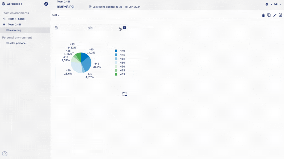
Pie chart
Pie charts are useful for highlighting proportions. Whether you're analyzing market shares, budget allocations, or survey responses, pie charts offer an intuitive way to showcase proportions and percentages within a dataset. With our intuitive drag-and-drop interface, users can effortlessly import their data and generate pie charts in a matter of seconds.
Create a pie chart
Add a visualization container to your dashboard.
Select the option 'Data visualization' and click on 'Create'.
This will take you to the create visualization page.
Add a title to your chart and add description of the chart.
Choose visualisation type as pie chart.
Choose data from the catalog by double clicking on the column names.
Drag and drop data chips from selection container to group and data container.
Pie chart is displayed on the visualization container.
Click on 'Details'.
Under details you have option to show or hide lebels, or change the pie color.
Click on create visualization button to create and save the table in your dashboard.
Data table is added in the dashboard.
Edit a pie chart
Follow the steps below to edit pie chart:
Hover over a pie chart container from the dashboard.
Three dot will appear on the top right hand corner of the chart container.
Click on the three dots and an option menu will appear.
Click on 'edit' from the option menu.
After making the changes to the chart, click on change table from the top right corner of the page.
Your chart changes is saved and chart is displayed on the dashboard.
Delete a pie chart
Follow the steps below to delete pie chart:
Hover over a pie chart container from the dashboard.
Three dot will appear on the top right hand corner of the chart container.
Click on the three dots and an option menu will appear.
Click on 'delete' from the option menu.
Click on delete to confirm your choice.
Your chart is permanently deleted.

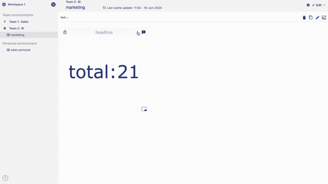
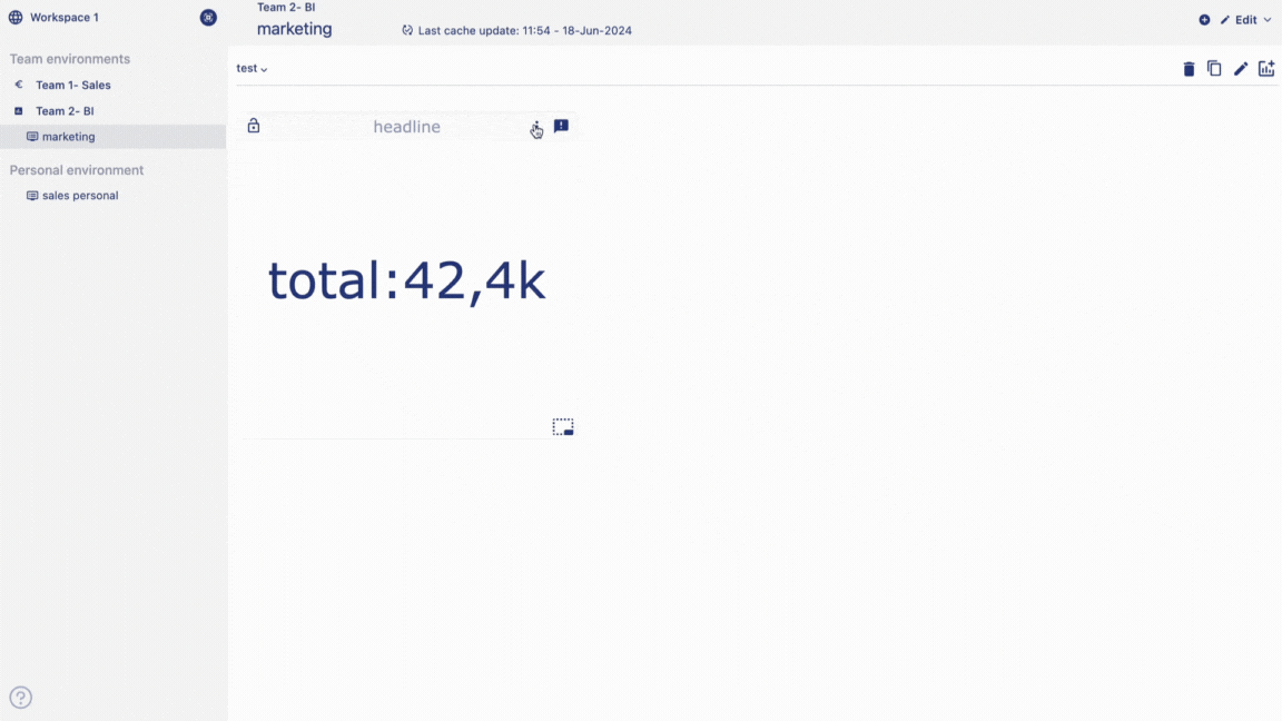
Headline Stastics
Headline statistics are used to display key metrics or "headlines" of data in a easily understandable format. These charts often highlight the most important information at a glance. For instance, they might include summary statistics, key performance indicators (KPIs), or other critical data points.
In a business context, headline charts could be used on dashboards or executive summaries to provide quick insights into overall performance or trends without overwhelming the viewer with too much detail.
Create a Headline Statistics
Add a visualization container to your dashboard.
Select the option 'Data visualization' and click on 'Create'. This will take you to the create visualization page.
On the sidebar, give a title and add descriptions about the chart.
Select chart type as 'Headline' by clicking on the headline chart icon.
Double click on the column names from the catalog.
Columns will be added as data chip into the selection container.
Grab a data chip from the selection container.
Drag and drop the chip into 'data container'.
You should see the chart displayed on the chart container.
Click on 'Details' from the sidebar.
Add a suffix and prefix.
Click on 'Create visualization' from the top right corner of the page.
Edit a headline statistics
Hover over a headline statistics container from the dashboard.
Three dot will appear on the top right hand corner of the chart container.
Click on the three dots and an option menu will appear.
Click on 'edit' from the option menu.
After making the chages to the chart, click on change table from the top right corner of the page.
Your chart changes is saved and chart is displayed on the dashboard.
Delete a headline statistics
Hover over a healine statistics container from the dashboard.
Three dot will appear on the top right hand corner of the chart container.
Click on the three dots and an option menu will appear.
Click on 'delete' from the option menu.
Click on delete to confirm your choice.
Your chart is permanently deleted.