Create a graph
Now that you have created a team, it is time to create your first graph. This page we will walk you through creating your first graph.
Written By Natalia
Last updated Over 1 year ago
Graphs are displayed on a dashboard. To create a graph, first, we need to create a dashboard. You can either create a dashboard under a team from the teams’ environment or in your personal environment.
Read before starting:
Create a graph
Creating graphs in Anlytic platform is very easy and intuitive. Follow the following steps to create your first graph.
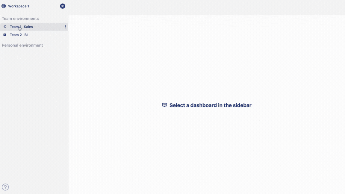
Select a
dashboardfrom the sidebar by clicking on thenameof the dashboard. Click on thedropdownmenu on the top right hand corner of the workspace to change themodeof the dashboard. You can choose between view and edit, and presentation mode. Click onedit. Click onadd rowfrom the top right hand corner of the dashboard. An input menu will appear,enter atitleto your row. Click onadd. A row will be added in the dashboard.Click on
add visualizationcontainer from the right hand side of the row line. Choosedata visualizationand click oncreate. Choosechart type. Choosedatafrom the catalog by double clicking on thecolumn name.
For a line chart, add a line by clicking on the
+ icon. Drag and drop the selected column fromSelection containerto theaxisanddataplaceholder.Give a
titleto your chart and adddescriptionabout your chart. Add X and Yaxis titlefrom details section. Click onCreate visualizationto save the visualization. Your visualization will be saved and displayed on the dashboard.
Congratulations! You have successfully created your first graph. Read our dashboard and chart section to know more about chart features and dashboard features.