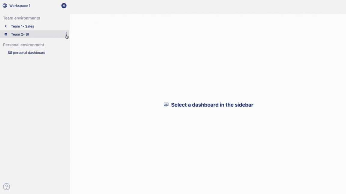
Dashboard
You can create dashboards under the team environment which are shared dashboards with your team. You can also create a personal dashboard which can only be accessed by you.
Written By Natalia
Last updated Over 1 year ago
Related topics:
We invite you to watch our tutorial to discover how to create and work with a dashboard.
And to read how to create charts here.
Create a dashboard
From the homepage,
hoverover the name of the team where you want to create the dashboard,three dotswill appear.Click on
three dots, an option menu will appear.Click on the option
add dashboardto create your dashboard.Give a name to your dashboard.
Click on
add.A dashboard will be added under that team.
Work with dashboard
The Anlytic dashboard consists of multiple assets that can assist you in creating your report and visualizations for analysis. The dashboard is designed with simplicity and easy usability for the user in mind.
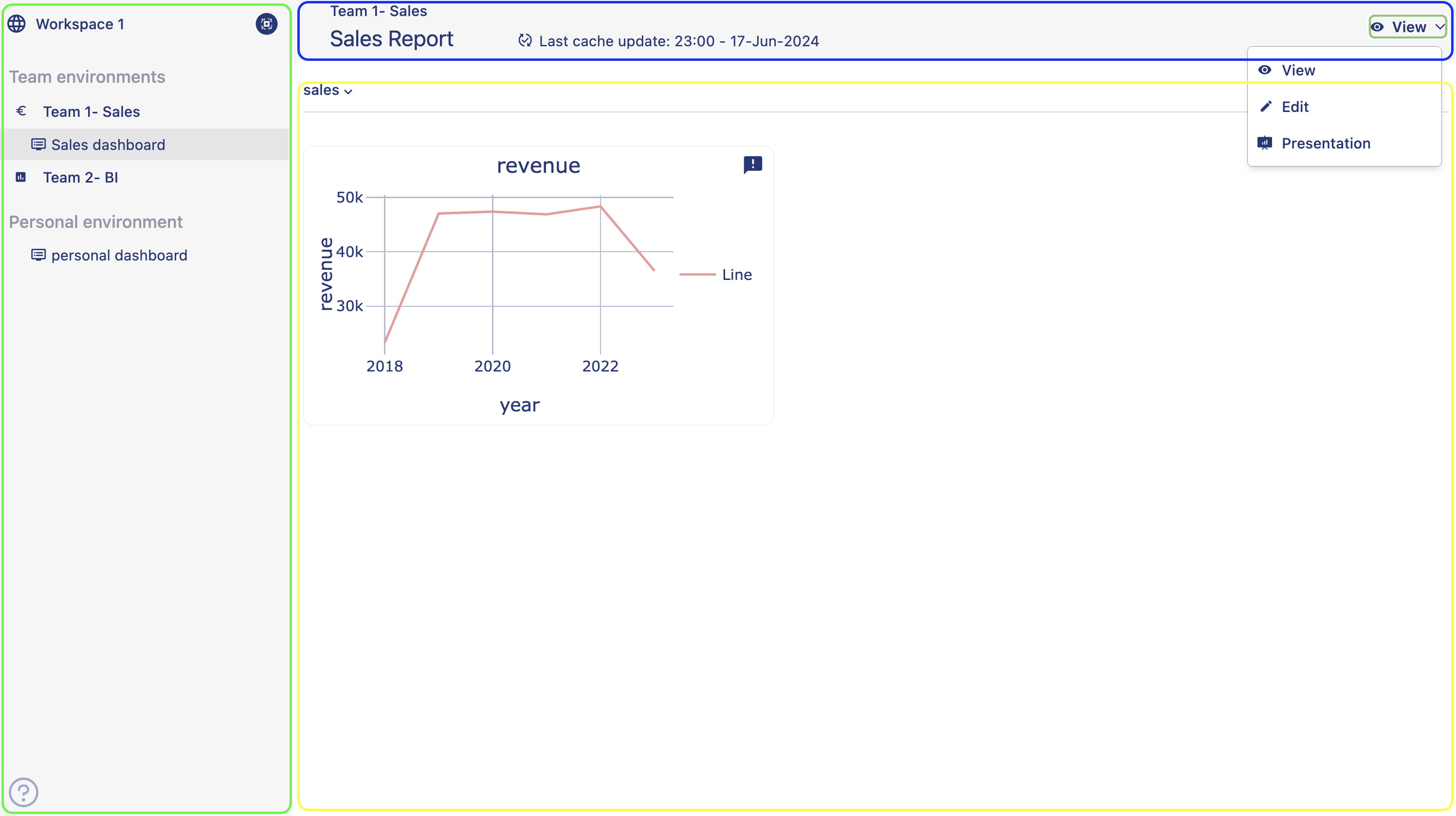
On the left-hand panel marked in green, you can see the name of the workspace, teams environment, personal environment, and the selected dashboard as highlighted.
On the top bar indicated with blue box, you can see the name of the team and name of the Dashboard, when was last cache updated along with changing dashboard mode button. Dashboard modes:
View: In view mode you can only view the dashboard and can not make any changes to the dashboard.
Edit mode: In edit mode all features are accessible, e.g. adding a chart, editing existing charts, organizing the dashboard.
Present: In this mode all editing options are disabled. You can use this mode to present your data in a presentation. In presentation mode sidebar is not available. You have to switch back to view or edit mode to access the sidebar.
Mobile: Mobile view is available only in ipads and mobiles. You can not make changes to the dashboard. it allows you to view the dashboard on the go.
Area within the yellow box is where you can see the visualizations. To create a visualization, you always have to change the mode from view to edit. In order to create the first visualizaion on a dashboard, you always have to first add a row to the dashboard. Once you create a row, you can see the icon to add a visualizaion container to your dashboard, Icon to edit the row name, icon to copy the row and icon to delete the row.
Now that you have got an overview of the dashboard elements, in the next page we are going to learn how you can create a dashboard.
Read how to create charts here.
To create a visualization, it is very important to understand how a chart is created in Anlytic dashboard. Creating a chart in Anlytic dashboard is very easy and simple once you are familiar with the UI.
Organize a dashboard
Organizing a dashboard is essential for presenting visualizations in a clear and coherent manner, allowing users to quickly understand key insights and make informed decisions. By structuring the dashboard with logical groupings using the row name feature, such as by topic, department, or metric, users can easily navigate through the information and find what they need efficiently.
Example
Let's take an example of a sales report to demonstrate how you can organize a dashboard.
You plan to create a sales report. You want to divide the report into two sections. One section consists of sales performance metrics such as total revenue, units sold, sales growth along with sales trends and sales forecast. In the other section you want to see charts about sales team performance, competative analysis. For the first section you need charts that represents revenue, number of units sold, sales growth trend, and sales forecast chart. For the second section you need a chart for sales teams performance and an explanation for competative analysis.
You can organize the first section under one row which will include charts that shows revenue, number of units sold, sales growth trend, and sales forecast chart. You can name the first row as 'Sales performance'. Then you can add another row to show the chart for sales teams performance and add a note continer to write an explaination for competative analysis. Below is an example of how an organized dashboard looks like.
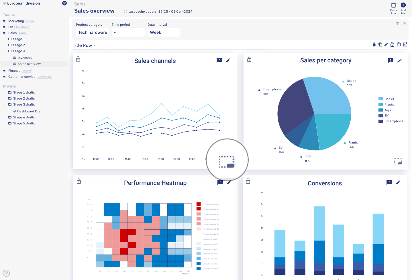
If you want to change the position of a chart from one row to another, you can simply drag and drop the chart from one row to another row. You can also have charts without a row as well. Just simply drag and drop the chart above the first row.
Resizing a chart is also very simple. To resize a chart, just hover over a container from the dashboard, click at the right hand side bottom corner of the container, drag your mouse downwards to make the chart bigger, drag your mouse upwards to make your charts smaller.